Nudefish – A Natural Aesthetic
04/12/2018
Caesarstone
Caesarstone
Project by: Nudefish Poké
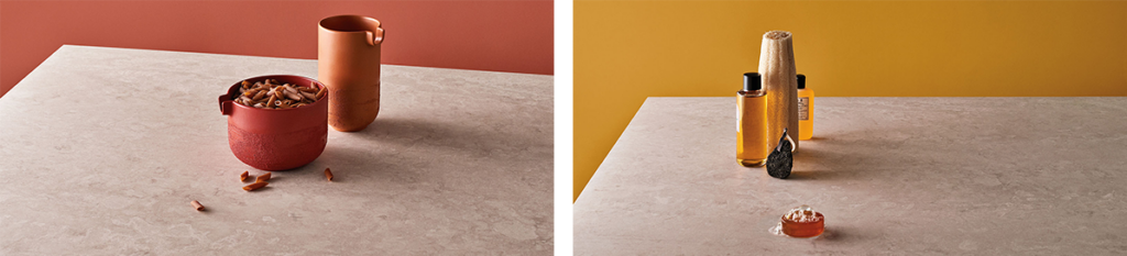
Benchtops: Caesarstone® Topus Concrete™ 4023
“It looks great, but it’s also very practical. We were looking for a bit of a softer feel to our designs.”
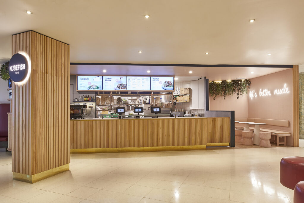
The fitout for Nudefish Poké’s latest outlet is understated, chic and practical – thanks to Caesarstone’s new Topus ConcreteTM.
Designing a beautiful, yet practical commercial space needs special skills – skills that can honour a brand’s aesthetic, yet still manage to stand up to the demands of heavy use.
This was the challenge facing Tom Walton, owner of the highly successful Nudefish Poké, now with four outlets throughout Sydney’s centre and eastern suburbs. Poké is one of the hottest new food trends of the moment, consisting of fresh and delicious sashimi-style salad bowls – and fast gaining a following with health-conscious city workers.
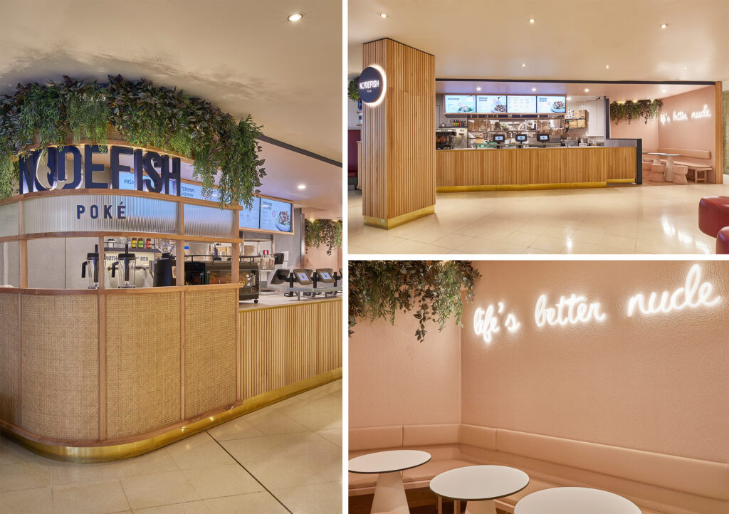
Nudefish is right at the cutting edge of the poké trend, boasting what is already a substantial following. The company’s newest outlet, just opened in a busy location in Sydney’s CBD, reflects the brand’s understated style with a palette of natural finishes and soft blush tones.
Working with Alexandra Morris of MorrisCo Design, the result is an elegant space that reflects the simple, clean and healthy food served up from behind the counter. This was MorrisCo’s first project for Nudefish, offering a softer aesthetic than the previous stores and setting a benchmark for the future.
“The plan was to realign what they were doing with their branding and marketing” explains Morris. “We wanted to bring that to life in the stores.“
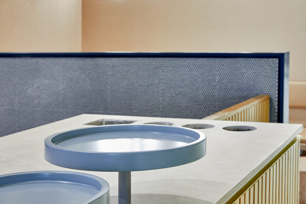
One of the highlights of the new fitout is the countertop in Caesarstone’s new Topus ConcreteTM – the first application of this new surface, and one which balanced beautifully with the timbers and muted tones of the design.
“It was a move to a more natural palette” Morris says. “The concept was to bringing in a more natural element, so we brought in a lot of natural timber, some warmer brass finishes and obviously the pink, which reflects their branding and the food.”
“Previously their stores were very cold – lots of dark navy blue, galvanised steel; very hard, cold finishes. Their target market is predominantly women, and their product is really fresh and mostly natural, so we didn’t feel that hard, cold finishes reflected their target market or their product.”
“The choice of Topus ConcreteTM was ideal” says Morris. “Initially we looked at a pink terrazzo, but it was cost-prohibitive – and the timing on it was just not going to work. We had to explore other options and saw this new range from Caesarstone. The finish that we ended up using had a very soft blush overtone, so it was perfect.“
“And not only was the colour right, but it just had that slight bit of texture and movement to it that just reinforced that natural aesthetic. And it’s also incredibly durable.”
Walton is full of praise for Morris’ design. “She’s great, she’s done other similar food retail spaces, and it looks great, but it’s also very practical” he says. “We were looking for a bit of a softer looking feel to our designs.”
The resulting fitout has been open for about three months and has set a benchmark in terms of design and practicality, says Walton. “It’s been our best store in terms of design and where we want to go with our next store.”
Caesarstone® works for him as a material because of the harsh demands placed on the benchtop during service and its ability to still look good even at the end of a busy lunchtime session. “You never want a too delicate material for this sort of thing” he says. “It’s a commercial setting, especially with benches, which are obviously harder to replace because they are right up the front and on show. Everyone’s looking at it as they come in; it definitely gets a big workout.”

{{ subtitle }}
{{ subtitle }}
{{ subtitle }}
{{ i.desc }}
{{ subtitle }}
{{ subtitle }}
{{ i.code }} {{ i.title }} {{i.custom_badge}} New {{i.low_silica_badge}} Limited Stock
No worries! We will send you an email to reset your password
If '{{this.email}}' email address exists, we have sent an email with password reset instructions.
Please note: If the email does not show up within one hour, check your spam folder or try to reset your password again after one hour.